


YUTA DESIGN / CASE STUDY
FurnitureRepTeam
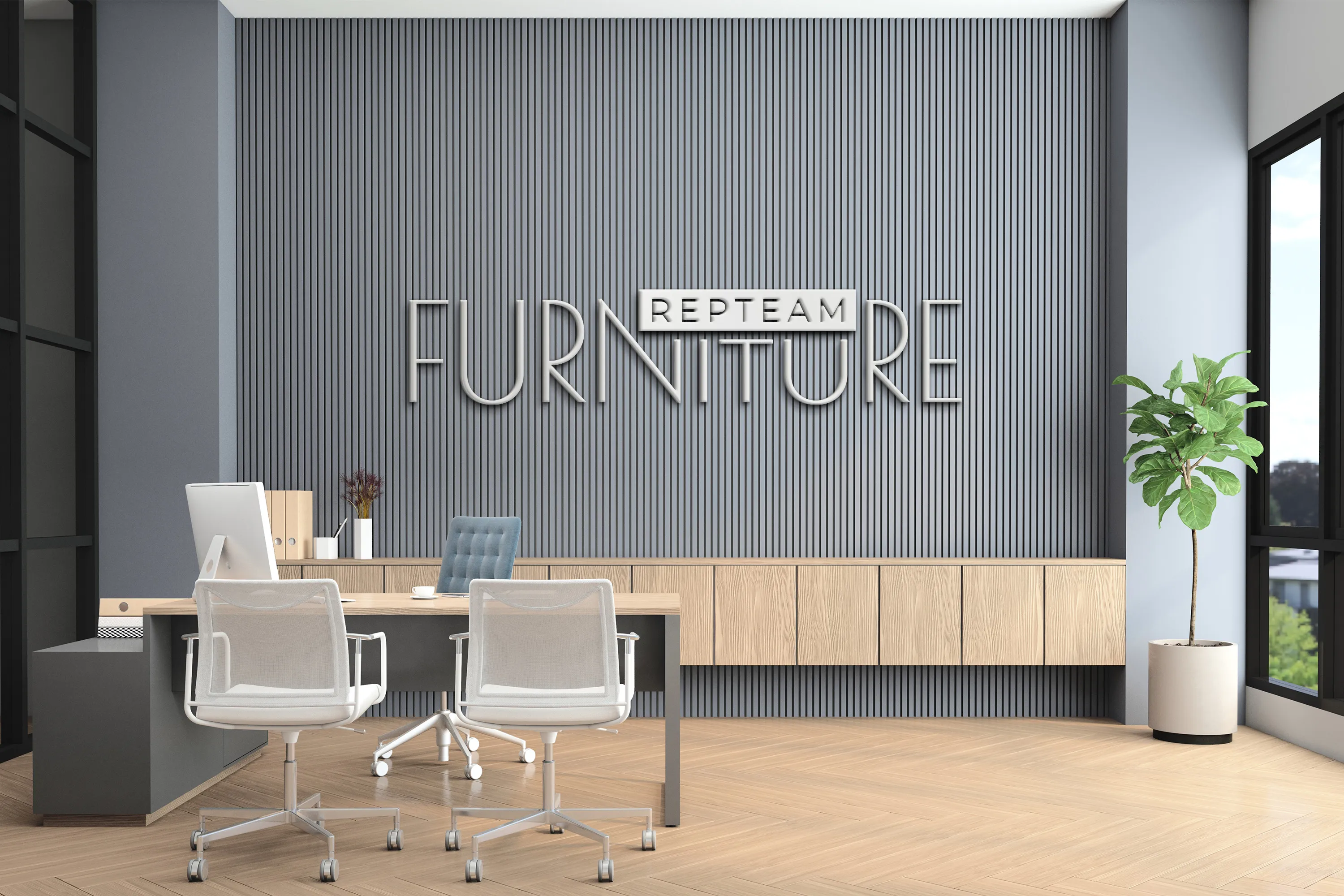
FurnitureRepTeam
FurnitureRepTeam offers contemporary furniture solutions focused on aesthetics, comfort and quality. Its portfolio serves residential, public and commercial spaces, with an emphasis on minimalism, functionality and architectural expression.

THE CHALLENGE
The brief was to develop a distinctive name suitable for trademark protection and a visual identity for a furniture brand.
The identity needed to:
- Express the furniture's architectural character and premium positioning.
- Work consistently across digital and print channels.
- Build trust with designers, architects and end customers.
The client wanted clean lines, design sophistication and a versatile visual system.

RESEARCH & POSITIONING
The research reviewed international furniture brands in the premium and upper-mid-market segments.
The audience includes architects, interior designers, property developers and private customers.
Brand strengths: architectural inspiration, carefully considered details and materials, and a calm, contemporary character.
Positioning: furniture as part of a thoughtfully designed space.
Key insight: soft forms, a natural palette and flexible typography help an interior brand fit into an architectural visual environment.


THE NAME
Furniture identifies the field. Rep refers to repair and restoration. Team emphasizes collaboration and expertise.
The name has a rational, businesslike character. It is easy to read and remember and is suitable for an international audience.
The name is versatile enough to address both private and corporate customers.

THE DESIGN SYSTEM
The identity combines geometric forms, a soft architectural aesthetic and visual rhythm. The logo balances precision with lightness, reflecting a considered approach to furniture. The system works across digital and print media and creates a recognizable visual presence.
APPLICATIONS & OUTCOME
A consistent brand identity was created for digital and printed materials.
The identity is used across the website, social media and print, as well as in communications with designers and partners.
The visual system reinforces the aesthetic value of the product.
SELECTED WORK
Explore more projects from YUTA Design's existing industrial and B2B portfolio.

YUTA
DESIGN

