


YUTA DESIGN / CASE STUDY
Konvekttehnika

Konvekttehnika
Konvekttehnika supplies, installs and services industrial furnaces and heat-treatment systems. Its expertise includes convection, gas and electric furnaces, thermal chambers and custom engineering solutions.
THE CHALLENGE
The brief was to create a logo and visual identity that communicate heat, movement and technical expertise.
The identity needed to:
- Build trust with engineers and manufacturing professionals.
- Remain legible and adaptable across industrial applications.
- Convey thermal processes without relying on familiar flame symbols.
The client wanted a modern, recognizable technical mark suited to drawings, packaging, building signage and workwear.


RESEARCH & POSITIONING
The research reviewed logos used by suppliers of industrial furnaces, heating systems and thermal equipment.
The audience includes engineers, procurement specialists, production directors and engineering design offices.
Brand strengths: technical expertise, tailored solutions, end-to-end support from design to commissioning, and experience with major industrial facilities.
Positioning: a reliable technical partner for industrial heat-processing operations.
Key insight: industrial branding benefits from precision, dynamism and meaningful symbols. The graphics should be technical without becoming overloaded.

THE LOGO
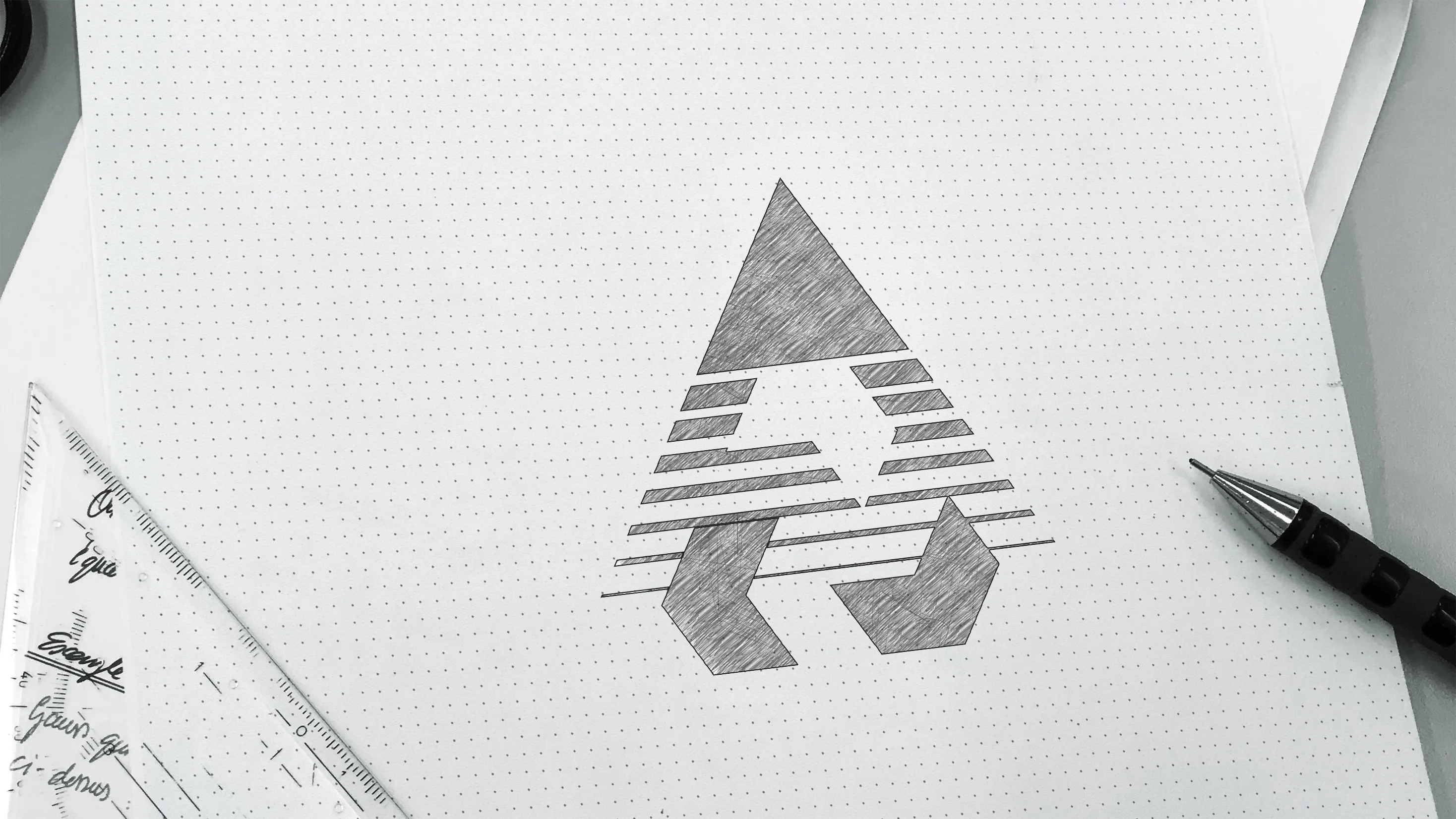
An abstract symbol combines the shape of a furnace chamber with directional lines, suggesting heat exchange, airflow and thermal processes. The wordmark has a dense, industrial character.
Graphite black and industrial red create contrast. Black conveys strength and reliability; red suggests energy and heat.
The logo scales across industrial applications and remains recognizable in monochrome. Applications include documents, workwear and patches, packaging, exhibition stands and presentations.


THE DESIGN SYSTEM
The palette combines black, dark grey and a red-orange accent. Heavy sans-serif type reinforces the industrial character. Lines, strips and grids suggest thermal movement, while modularity and symmetry refer to engineering drawings. Applications span facilities, presentations, tender documents, websites, social media and packaging.

APPLICATIONS & OUTCOME
The client received a complete visual system: logo, colours, typography, graphic elements and usage guidance.
The identity was designed to improve recognition and make the company easier to identify on industrial sites and in business documents.
The system communicates the company's technical specialization and supports a modern, reliable image across industrial media.


SELECTED WORK
Explore more projects from YUTA Design's existing industrial and B2B portfolio.

YUTA
DESIGN

