


YUTA DESIGN / CASE STUDY
Steklopleks

Steklopleks
Steklopleks supplies reinforcing fibreglass mesh to large commercial organizations. The products are used in construction to reinforce plaster layers and help prevent surface cracking.



THE CHALLENGE
The brief was to create a visual identity for a new brand that communicates the technology and reliability of its products.
The identity needed to:
- Make the brand relevant to audiences in the CIS and international markets.
- Stand out from competitors while retaining a clear, professional character.
- Create a versatile system for packaging, exhibitions and advertising.
The client wanted a minimalist logo associated with technology and the construction industry.

RESEARCH & INSIGHTS
The research examined packaging solutions used in the construction industry.
Visual preferences of audiences in the EU and CIS were considered.
Construction professionals value clarity, structure and a technical approach to design.
Key insight: straight forms, precise lines and restrained colours support trust in B2B communications.
Design priorities: clear geometry, a professional palette and consistency across different applications.


THE CONCEPT
The central idea was to communicate technical expertise and reliability through a simple, precise visual language.
Clear structure and geometry, a restrained palette and flexible applications form the basis of the concept.
Complex illustrations and excessive decoration were avoided to keep the identity easy to read.

THE BRAND MARK
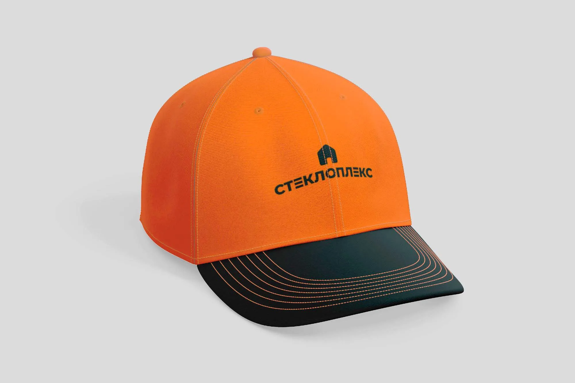
The Steklopleks logo combines a technical symbol with precise typography. Orange provides an energetic, technology-focused accent; grey and white keep the identity professional. The simple mark scales across packaging, print and branded merchandise.

THE DESIGN SYSTEM
The visual system uses a restrained technical palette with an accent colour and modern sans-serif typography.
Straight-line structures and modular grids bring consistency to the graphic language.
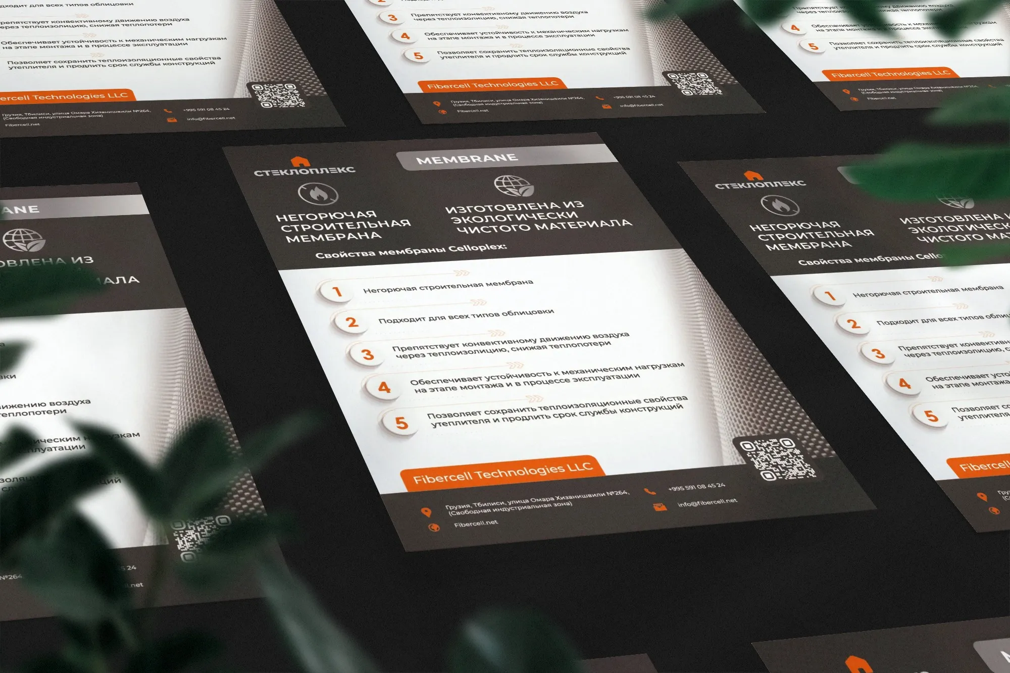
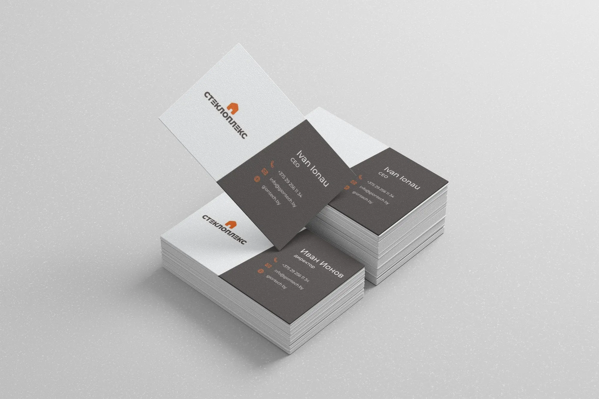
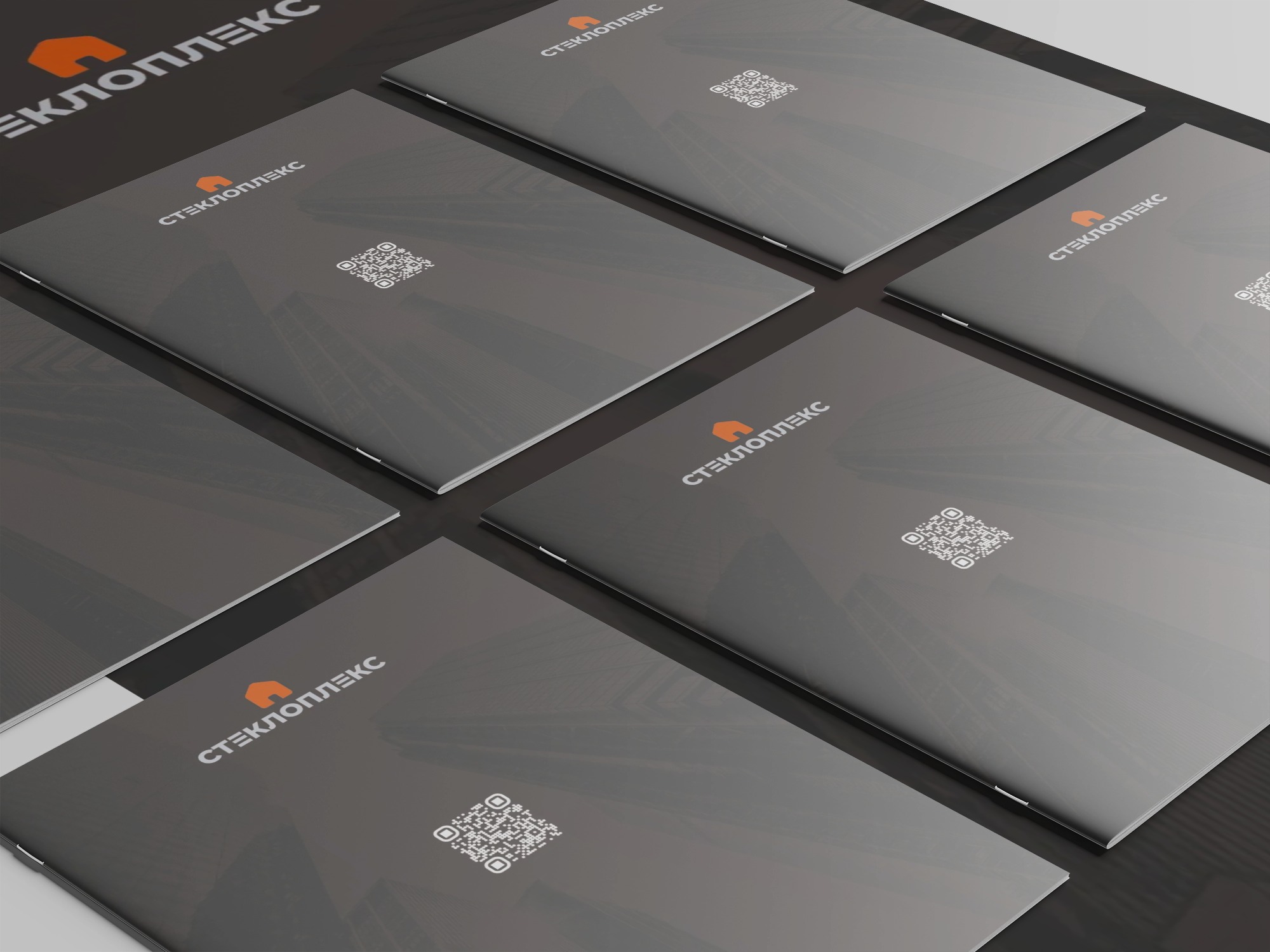
Applications include labels and packaging, folded brochures, exhibition materials and branded stationery.
A COMPLETE BRAND PACKAGE
The client received a logo, visual identity and designs for product labels, folded brochures, exhibition stands and branded merchandise.
The system brings consistency to the new brand across its materials and presents a contemporary, technology-focused image.
The project images show how the Steklopleks identity is applied to product labels and other brand materials.


SELECTED WORK
Explore more projects from YUTA Design's existing industrial and B2B portfolio.

YUTA
DESIGN

